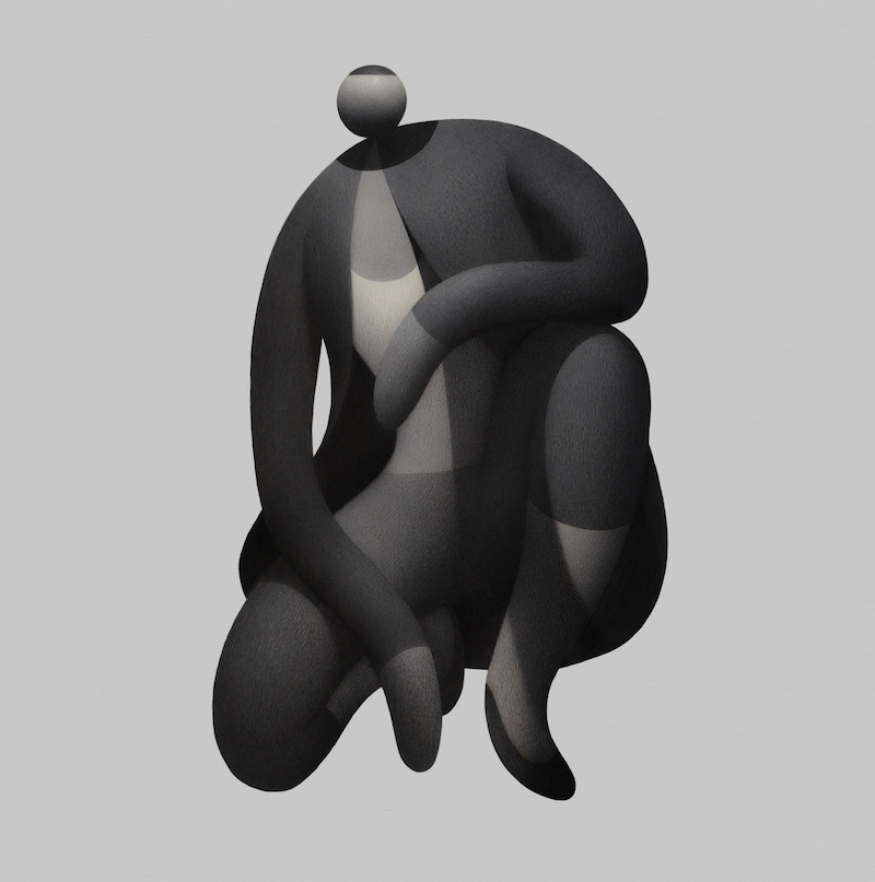
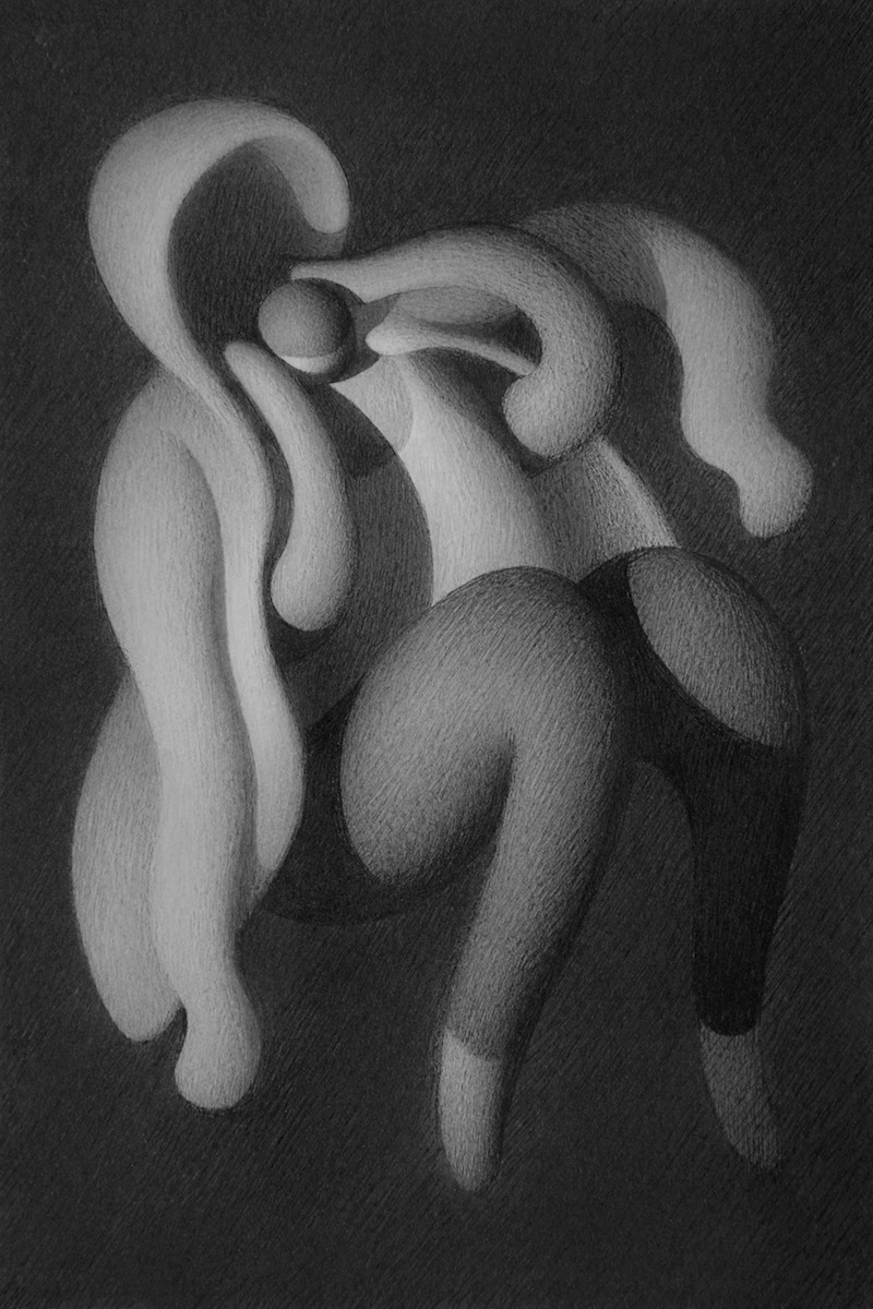
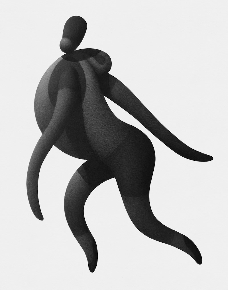
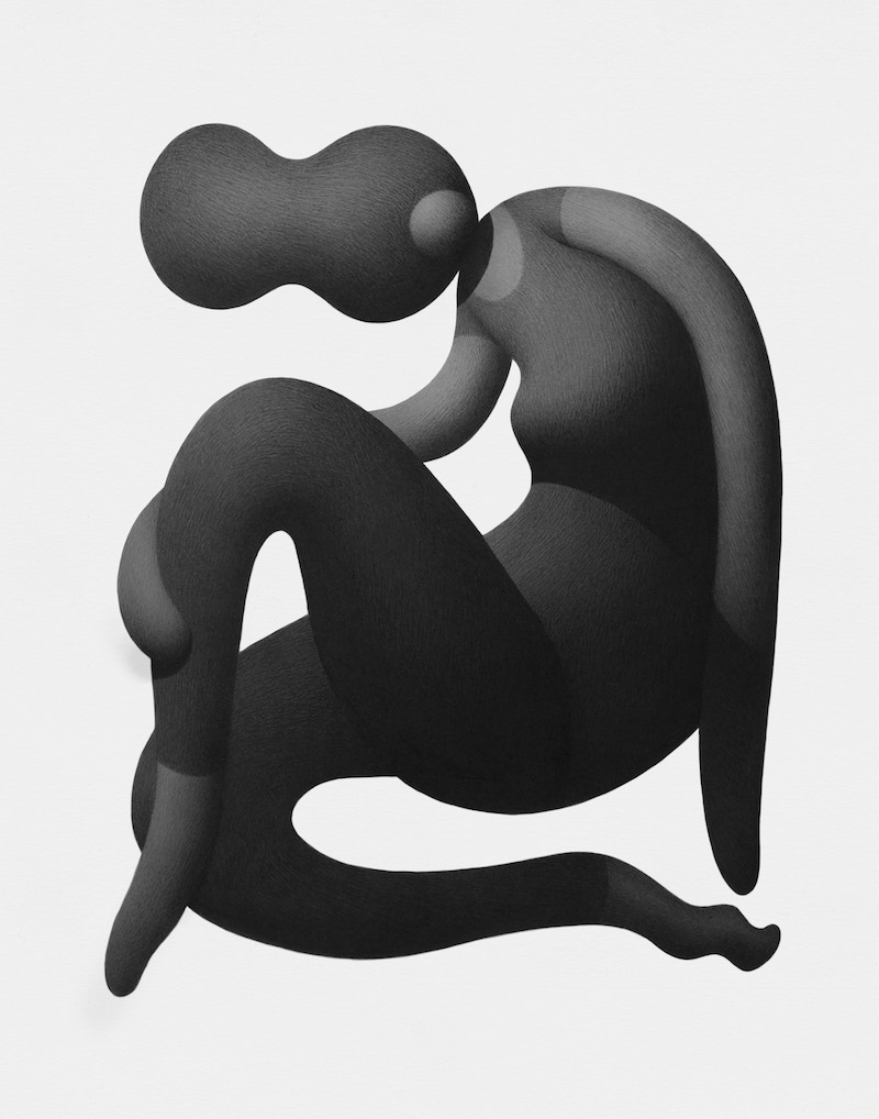
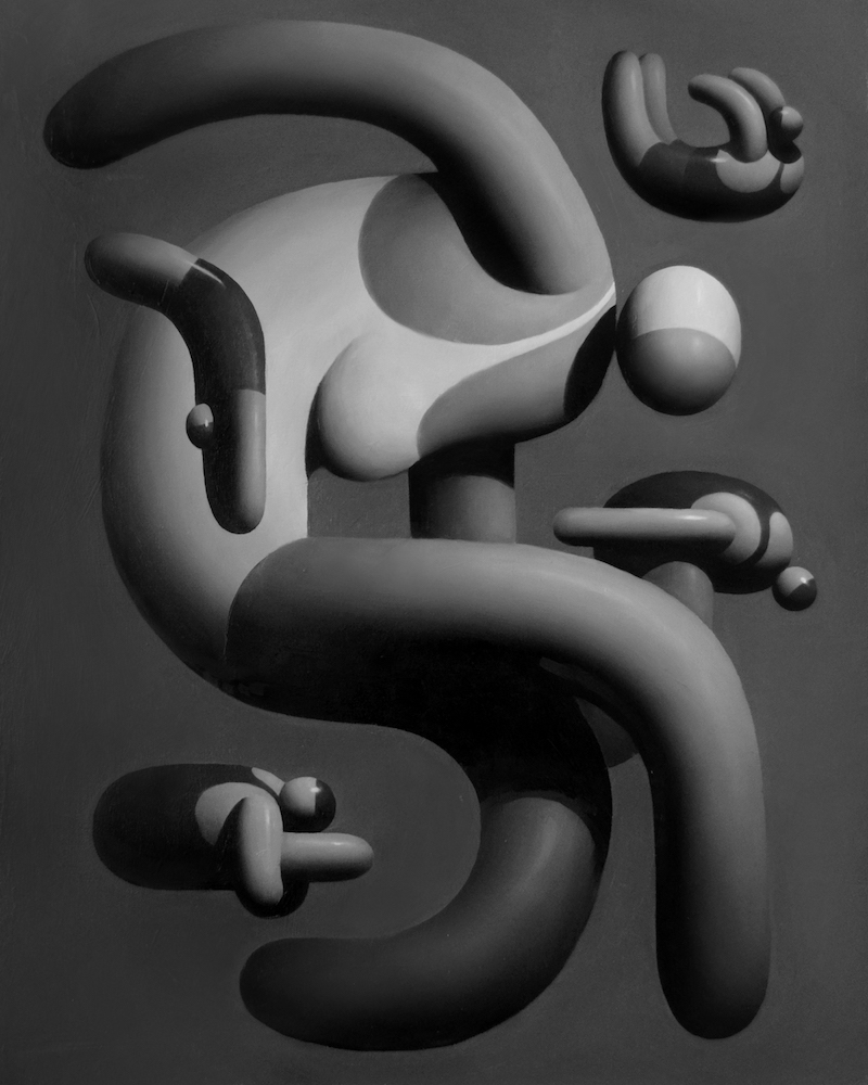
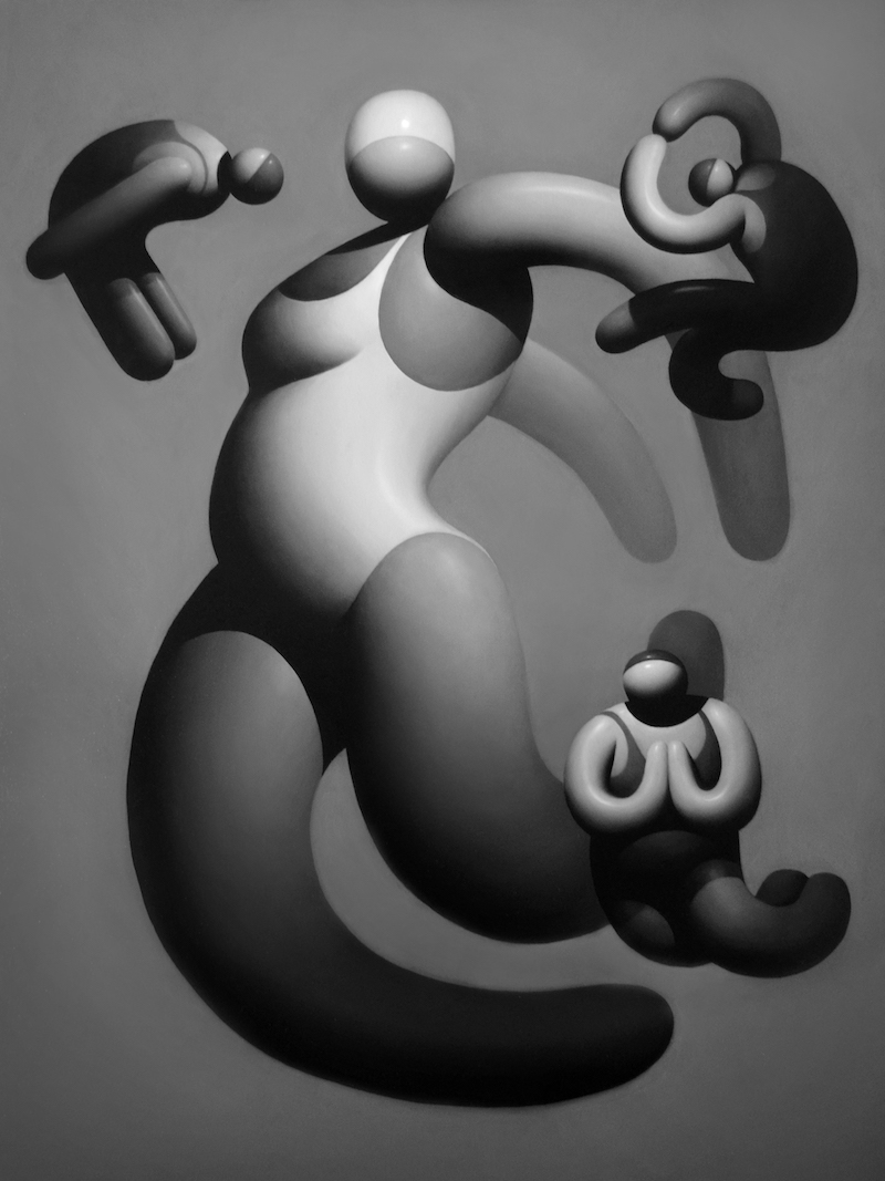
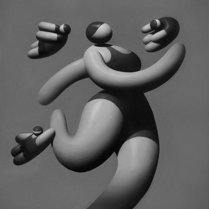
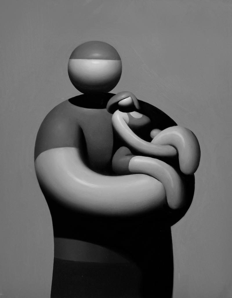
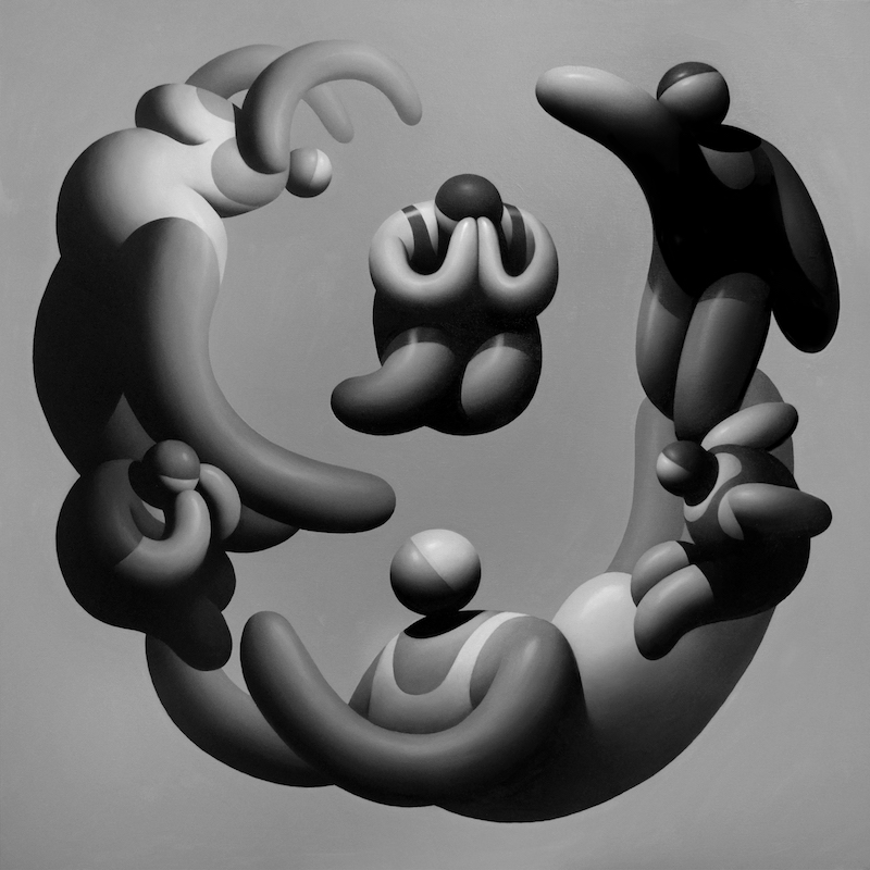
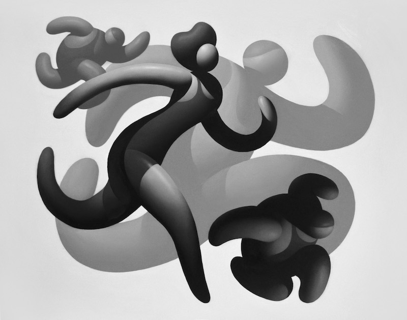
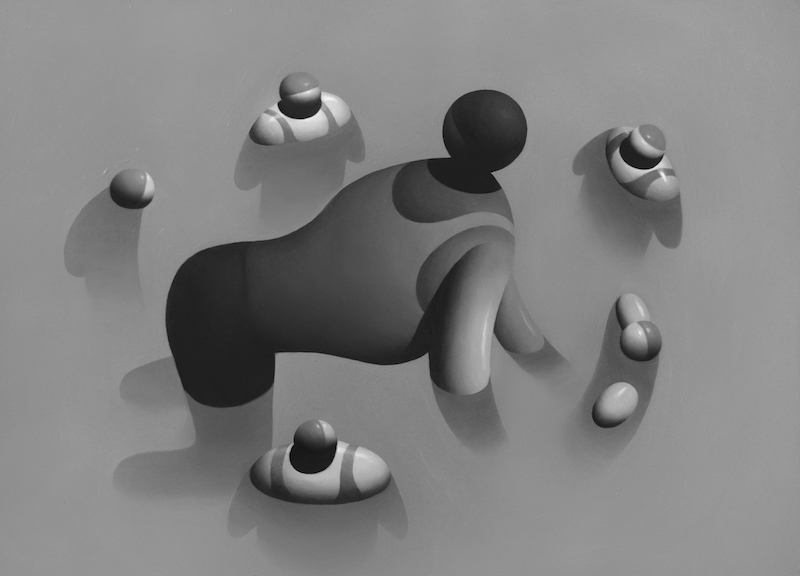
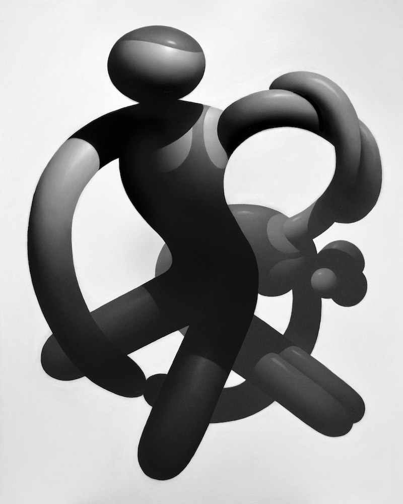
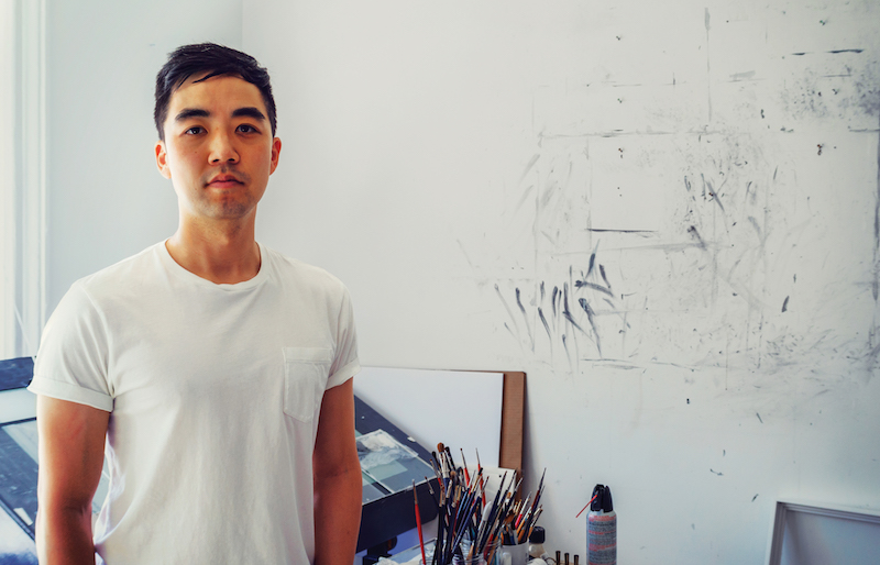
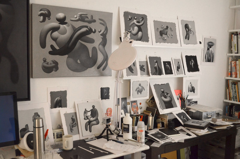
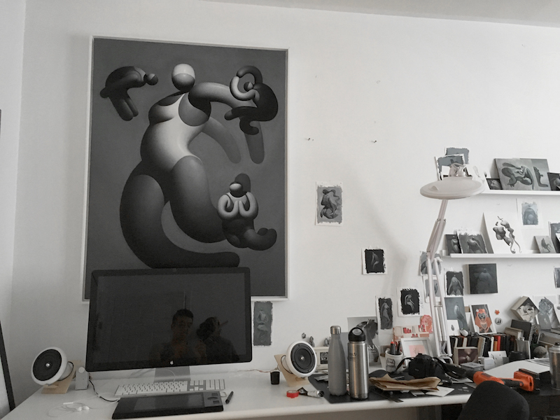
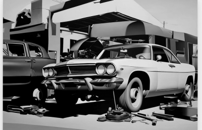
Those of us who are not astronauts or skydivers will probably never get to experience the actual feeling of floating in space. Yet weightlessness is an exceptionally appealing physical and mental concept. Rather than bearing the “weight of the world,” it uplifts with a sensation of ultimate freedom and deliverance. Digital media professional Mike Lee developed a process using everyday tools to construct atmospheric oils that depict just that feeling. His figures levitate in a void, with meticulous grayscale gradients, rendering conspicuous light effects. Drama and mystery hover beyond the harmonious surface. Eliminating key pieces, Lee leaves it up to the viewer to complete the picture and create their own puzzle.
Sasha Bogojev: Is there a certain time and place where your images are set?
Mike Lee: No, it's more about absence. I'm trying to remove any sort of narrative, and everything's meant to be, in a way, generic. That way anyone who views the work can bring any past life experiences to the paintings. I don't know if you've seen dolls for children that are blank with no features? I like how they become a mold for whatever is desired. It's that kind of idea—trying to remove facial features, the physical base, so people can fill in the blanks. I want to be inclusive so that any race, gender or ethnicity can see themselves in the work. At the same time, I'm trying to make my paintings appealing, so, hopefully, on the superficial level, people can enjoy a nice image. And if they wanna dive deeper, they could find meaning within it, too.
Aside from trying to produce generic images, there are some details such as clothes or hairstyles. How important are they and how much attention do you give to them?
I spend a lot of time trying to figure out the right design for those. I'm trying to get the most engaging shapes and hopefully represent a certain type of person. Sometimes I even try to bring in really subtle political or social elements without being overly obvious.
What’s an example of such an element in your work?
One was around the time Trayvon Martin was killed. So my reaction was to slowly introduce hoodies into my work. I try not to be overtly political because I just never feel like I know enough about it, but I've always been a real observer, so all I bring to my work are the things I've seen and experienced.
That meshes with the idea of forgoing details. Since your work is mostly about feelings and emotions you've personally experienced, how do you translate those into such harmonious images?
A lot of times, there isn't a specific emotion. It's more about using the light to create a certain type of drama or setting. And. again, the intent is that everyone who views the work can project their own life onto it. I've gotten a lot of reactions like, "Oh these are really depressing images," which is interesting. That wasn't my intent.
I was going to say that I’ve always found your images uplifting and positive, perhaps melancholic, but never depressing.
I've gotten similar reactions to yours, too. Some people find them really amusing, some people laugh. There's a pretty wide array.
Are there any references to gender in your work?
There are definitely male and female figures, but sometimes I purposely blur gender lines to avoid absolute definitions. I want to include everyone. Hopefully, those in the LGBTQ community can see themselves in the work as well. I'm trying to be considerate toward everyone and bring many layers of ideas to the work.
I've noticed that lately you've been constructing more complex pieces with many different characters.
The earlier work was about a single figure, and sometimes I'd pair them up, but now I'm trying to get more graphic with the overall composition. I'll actually start with abstract shapes and compose figures to fit that design.
I keep thinking of synchronized swimming when I'm looking at those. Am I far off?
I think it ultimately deals with being suspended in a space. So it can be floating in a void space, or underwater, which is pretty much the same thing. Just removing gravity. Also, I'm not very knowledgeable when it comes to art history, so I rely on friends who know way more than me. At one point, they pointed me toward all the beach paintings by classical artists, so I started bringing those ideas into the work.
Speaking of art history, do you have a particular artist or art movement that influences or inspires you?
I pretty much love every aspect of art as long as I can see authenticity in the work. But rather than having reference sheets, I like to just remember the impression paintings, drawings, and installations had on me. It becomes a hodgepodge of influences where, hopefully, the viewer won't identify another artist in my work. I do my best to be as original as possible, so if I see someone doing something similar, I lose interest and will go in another direction.
Where did you grow up?
I’m from a small city called Placentia in Southern California. It was like every other suburban neighborhood. I found myself being anxious from boredom so I always tried to find ways to fill my time. But when I think back, the days spent in the pool or at the beach were pretty significant. I moved to New York in 2007 after working in San Francisco, and I was really surprised how much it immediately felt like home. The pacing, people, transit, food, art. It was how I always imagined myself living.
For me, NYC always felt like a giant, gray megalopolis. Does that influence your work?
For sure! Not the gray part, but more from the experiences and people that the city attracts. Also the energy I get from everyone around me constantly pushes me to work harder.
Are you saying that light and shadow are a very big part of your work, the source of the atmosphere, rather than the characters themselves?
The posing definitely adds to it. I suppose it goes hand-in-hand—the specific pose along with the light. For instance, in the body of work I just painted for the Japan show, I wanted to evoke positivity with the work. So I wanted to bring in more active and dynamic poses.
Most of your work is very small scale. Why do you chose to work in that size?
I think, initially, because I was still learning how to handle the medium, I just wanted to make sure that I could generate as much work as possible. I'm still learning through each painting. At the same time, I like the idea of making smaller works that aren't too expensive and pretty much anyone can afford them. I just wanted people to have the work.
You don't have any formal artistic or painting education, do you?
No. I've been painting for about two and a half years now, but all my friends are painters, so I'd just learn from them. It was pretty much pencil and pen throughout college. Then I moved on to Copic markers and pens, trying to mimic the feel of graphite. I played around with other mediums, but I couldn't find anything that came close to the richness of oils.
Was it something you just started in your spare time, or more of a personal challenge to become an artist?
It wasn't so much about wanting to be an artist, but it wasn't just a hobby either. I just wanted to create something for myself. And there was something more tactile about original work, something I can't really get from a digital image.
That can be an issue with digital art.
It's not like the digital side is less skilled. I definitely appreciate good design no matter what medium. I guess I just prefer the human touch.
Your images seem to be easily translatable to 3D. Do you have any interest in sculpture?
That’s my dream. I’m pretty sure I’d need help, but I’d love to create large public art sculptures or installations. I haven’t had any opportunities yet, but I’m sure I will one day!
What about motion? Especially considering your digital media background, do you ever imagine your work coming to life?
I was thinking about possibly creating an animated short film. I was thinking of working on something like that one day. And I can be OCD, so I'd probably go crazy and just end up rendering every frame by by myself.
I was going to ask about your color palette. Did you ever consider trying anything else other than greyscale?
I've been thinking about it for a few years. If I'm gonna go with color, it's gonna be a complete 180. Full saturation!
Just neon and fluoro!
Yeah! I love contrasting ideas. So if that day comes, it's gonna be bold.
Mike Lee opened a new show this fall at Amala Gallery in Tokyo.
This article was originally published in the print edition of Juxtapoz Winter 2018 Quarterly.

