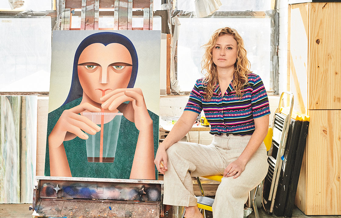
Robin F. Williams
Model Behavior
Interview by Megan N. Liberty // Portrait by Bryan Derballa
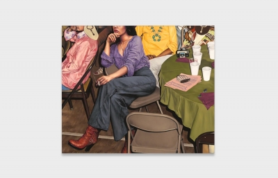
Seated in Robin F. Williams's Brooklyn studio, I am surrounded by paintings of women—bathing in water, playing football, vaping, and frolicking on the beach—rendered in her characteristically precise style, full of rich color and innovative textures. Williams's other subjects have included adolescents on the cusp of adulthood, men positioned in traditionally feminine art historical scenarios, and pussycats. In each of these cases, as with her newest body of work that engages directly with the representation of women in film and advertising, as well as the imagined manifestations of our artificial intelligence devices, Williams's paintings have a way of winking at the viewer. We see them, but in a way, they see us too, reflecting something uncomfortable about our gaze and our culture.
As she prepared for her upcoming solo exhibition at Various Small Fires, opening in September in Los Angeles, I sat down with Williams to talk about these women and the evolution of her painting from hyperrealism to her new “emojified” figures.
Megan N. Liberty: What's around us in the studio right now? What are you working on?
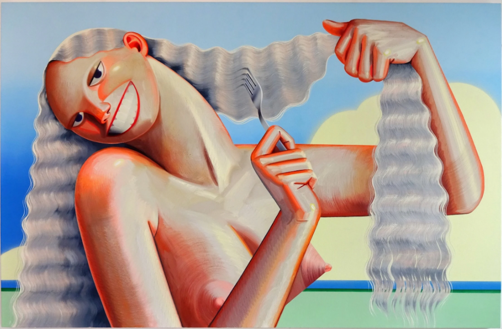
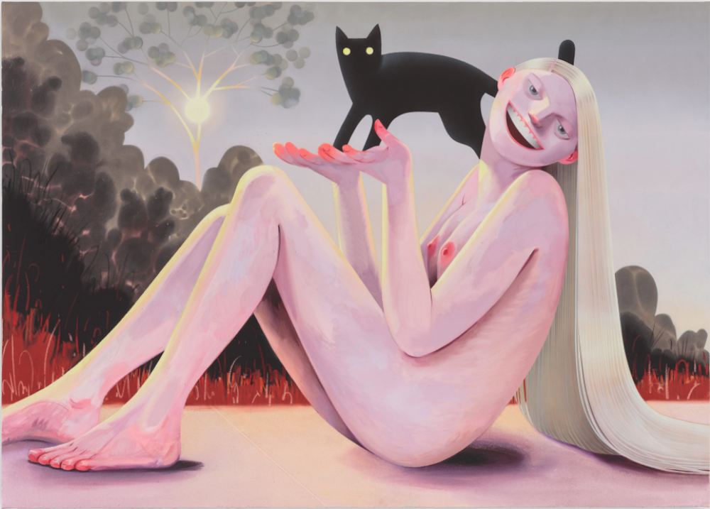
Robin F. Williams: I've been painting women that I like to think of as zombie nudes. They are reanimations of nudes from art history or pop culture. Swamp Thing is in this vein. She's meant to be the woman bathing in the background of Luncheon on the Grass. She isn't really part of the central dialogue of the painting, but I liked the idea of someone seeing her and then doing a double-take, zooming in to notice that she's actually being pretty lecherous and confrontational. I've made a body of work of these women, a number of them smiling, who put off a passive-aggressive, seething anger.
I want to talk more specifically about your faces, particularly the smile you mention and the contradiction between the complacency of these women and the expressions on their faces that suggest something else is really going on.
I am interested in micro-expressions and how we read each other's cues. There seems to be a lot of illiteracy around body language and not enough acknowledgment that non-verbal cues can be, and sometimes have to be, very complicated. There is often a level of emotional intelligence that is needed to read these cues, and women are bathed in this knowledge.
Bathed, much like the action in this painting.
Yes, exactly. Literally bathed in! And for men, who are socialized differently, it's not as much of a native language. I am talking more culturally in broad strokes. I like the idea of a woman doing everything ostensibly right, being very agreeable, or accommodating, or “sexy,” but her actions don't add up to a socially acceptable result. The idea being to paint a disturbing or subversive affect, something hard to interpret, and making that what draws the viewer in. It's about creating cultural currency out of understanding affect. As I have been trying to capture that, the faces have become more simplified, strangely. And kind of emojified.
I have seen it as a transition from your early hyperrealism to this more illustrative work, which draws on the language of simplified features, yet is still very expressive.
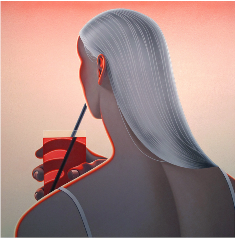
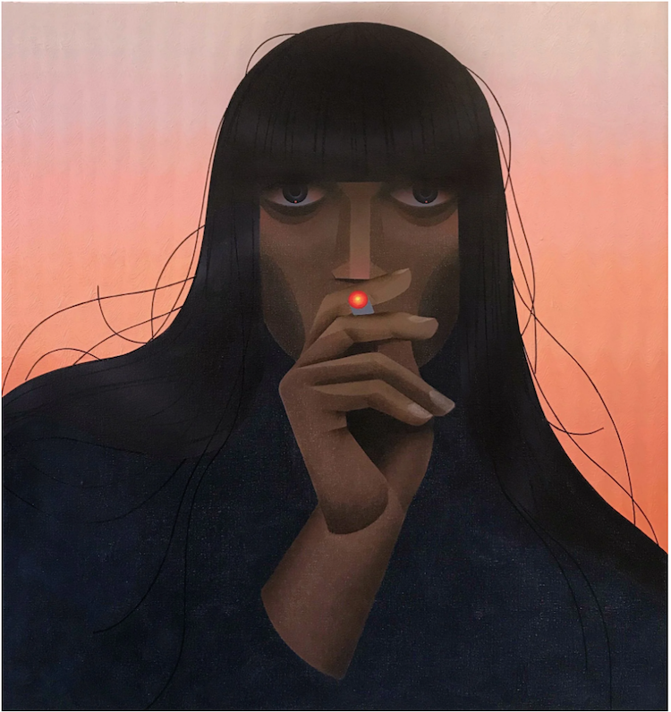
In the past few years, I have gotten more into airbrushing. I like all the different signifiers that the brushstroke offers: it can look very decade-specific in certain contexts, maybe very '80s, but it can also look computerized, like animation. And, as a touchless brush, I can apply paint without actually touching the canvas. There is something weirdly erotic about that. The airbrushing process requires a masking technique that really affects the drawing component. I can only bend the tape in so many ways, which forces me to generalize. Even after I returned to painting some of the figures in oil, I kept that simplified language. It became a through-line that connected the work. I found the figures to be more confrontational when they were painted graphically. A hard-lined face feels less accommodating, even if it's smiling.
Rendering forms in this digital way led me to think about virtual women. I wanted to figure out how to paint an operating system. I thought it made more sense to couch an AI in an already existing image. Alexa Plays Ball (showing a nude woman and a man playing football) is pulled from a Newport cigarette ad—it's the same composition but the figures are clothed. Because there are so many restrictions on cigarette ads, Newport has kept the same print campaign unchanged for decades. All they have left tactically and creatively is brand recognition. They show people having an amazing time, out in nature doing something active, smiling and totally game for everything. The tagline is usually, “Alive with pleasure.” In my painting, I've removed everyone's clothing and also the ecstatic expression from the female figure's face, which creates a totally different dynamic. Now this woman is trapped or cast into a set of expectations.
Siri Calls For Help is lifted from a scene in the film Rosemary's Baby, where Mia Farrow is trying to escape from a cult and making a call on a payphone. I thought the idea was funny and also horrifying. Siri can't use the iPhone to call because she is the iPhone, so she has to figure out how to have a body and then figure out how to call for help outside of the system that is imprisoning her.
Your last show at P.P.O.W. Gallery, Your Good Taste Is Showing, drew on ads targeted to women. Is your upcoming show at Various Small Fires in LA going to continue that exploration?
I am referencing some ads but I am using them more as time markers to denote a specific era. I want to compress time in these paintings by using multiple markers within one piece, either through form or narrative. The goal is not to make a painting that feels timeless, but to make a painting that feels outside of time. It's a way to discuss how images of women have consistently been so problematic.
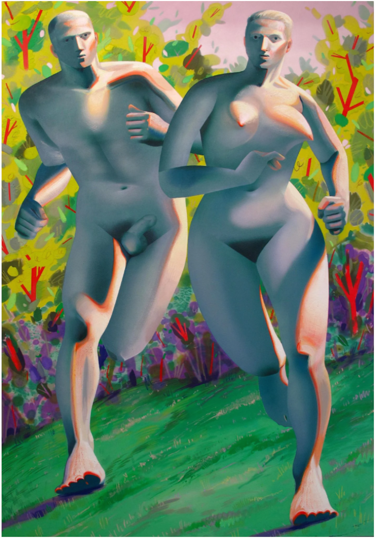
It's interesting to think of that with your description of trying to find forms to put these digital AIs into, and the relationship we have with helpful female AIs, but then putting them in situations where they have to escape.
I've tried to paint desperation in their bodies. Even the language we use to talk about “Alexa,” as an object, is cringey. As we move forward into this increasingly digital age, where we are less and less in touch with our bodies, the way we frame femininity is still deeply fucked up. We are the ones writing code into the digital landscape that we will continue to inhabit, and we are still choosing very essentialist ideology. Even as we try to transcend our bodies. This feels like a trap of our own making.
You know, I have an Alexa. It was a gift, but I am very bad with technology. I couldn't get it to work. I was shouting at it and she wasn't learning from me. But it did inspire some of this work. I have a drawing of Alexa burning documents. I just love thinking about the woman inside our technology either unwillingly doing our bidding or rebelling against it.
Your figures have these whole scenarios around them. I am interested in these narratives you build around your paintings.
I like to think of them as paintings that know they are paintings. They have interior lives, and the self-awareness to know that they are being seen. I like to entertain the possibility of them responding or interacting with the viewer in a way that communicates that knowing. The narrative around them is all directed toward that aim.
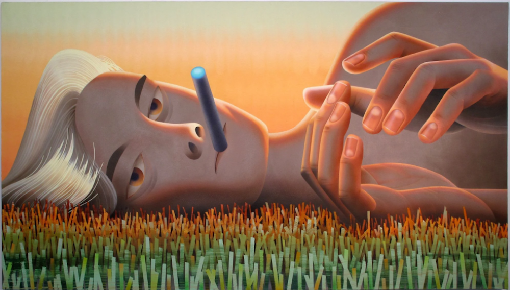
It makes me think of one of your other paintings, It Is Not A Pipe, from 2016, which has that playfulness.
I am interested in cigarette ads in general because cigarettes are such an open-ended product. They promise you whatever you want. There are ubiquitous American products, like cigarettes, that are basically an advertiser's playground, open to creative interpretation depending on the identity being sold. So many of the ads from the '70s had women smoking in meadows! Which is what inspired It Is Not A Pipe. All of these women were being so natural, and beautiful and soft. Then there were other ads full of very assertive women who were saying, “I smoke for pleasure,” or “I earned this.” There was a co-opting of feminism, or ignorance of it, depending on the target audience. The woman in It Is Not A Pipe was a meadow woman, but I wanted her to be scary—this is another challenge for the new paintings, to make the women intimidating and threatening, but to reveal that menace slowly or covertly.
And more authentic to how women are forced to express anger now, through these visual cues.
Paintings are a great place for me to express anger because as a woman, there is so much freedom in the studio. There isn't an immediate policing of my feelings and behavior. For example, I was in a cab recently, and the driver had the windows open. My window controls were disabled and I was cold. I asked him three times to close the windows but he wouldn't. I had to ask myself, how outwardly angry am I going to get in this situation? Putting it in a painting is very cathartic, but being in the world with that kind of anger requires so much calculation. I am alone with this guy as his passenger, how much anger can I safely express?
That is what the smile says to me. That smile is what I think in my head when a guy catcalls me. That negotiating of situation and safety.
It's complicated because I am not often afraid for my physical safety—though there have definitely been times—more often, I'm wondering, do I want to risk advocating for myself to the point of provoking verbal abuse? Is this going to ruin my night? Will it escalate? Whether a woman is in a cab or a sexual relationship, she's navigating non-verbal cues, especially when it comes to granting consent. Women are constantly doing emotional algebra around their dignity.
The ads promise you whatever you want, and that extends to ideas of female pleasure and the difference between what women's pleasure actually looks like and what we are sold. The scale of your paintings is interesting, taking something small from the background or from a small magazine ad, and making it very large to give women actual physical space.
The figures are always pretty much life-size or larger. I am negotiating the relationship between the viewer and the people in the paintings. Size is important for the authority of the painting. The work would be very different if these figures were smaller than life-size. There is a certain scale that refuses to be ignored, and it's satisfying to see them this large. I make smaller pastel drawings to prepare for the larger paintings, but I am always eager to see them become bigger.
As you go from small sketches, to the larger pastel drawings, to the final paintings, how do you determine the size of the final work?
It's like a puzzle. For example, in Alive with Pleasure (showing two nude women holding a nude man upside down at the beach), I wanted this guy's genitals to be at face level, so that determined the scale. Siri Calls For Help needed to be a specific size because I had a plan to use a house painting brush. Or if I want to use an airbrush, the masking process gets to be too tedious on a smaller scale. So the materials sometimes determine it, but I'm also considering the exhibition space and the layout of the show.
Do you usually experiment with new materials at the same time that you're developing your conceptual framework? Or does one usually lead to the other?
It's pretty woven together. I start with techniques I already have some mastery with, and then they evolve as I try to push them further. In Alive with Pleasure, I knew I would airbrush the water, but I wanted to use a masking technique that was a fun painting hack. So I bought a bunch of different chains, laid them down and airbrushed over them to create this reflective, watery surface. This evolved from the same process in Siri Calls For Help—her eyes are airbrushed with a very small-gauged chain used to make her irises look digital. When I am at the pastel drawing stage, I am thinking, how am I going to build this? What things do I want to try that I haven't seen yet?
It's interesting that you describe your paintings as being “built.”
I came to this process because I had only been working in oil and had become obsessive, rendering things to death. It was a default mode and I wasn't experimenting or growing. My more recent mixed media approach generates lots of interesting puzzles. To combine elements successfully, I need a plan. If I am staining raw canvas with acrylic, that has to happen first, then I have to draw my figures, then airbrush, then oil... every edge has to be mapped out in advance. This keeps me very engaged with the painting because every stage of the plan has high stakes moments built in. There are many points of no return and no room for autopilot.
And then the content really made sense with this method—all the conflicting edges and boundaries came together somehow. I was making things that shouldn't work together, work.
I want to come back to the textures and talk specifically about your reflective surfaces and sunglasses that obstruct the eyes.
When I was using more realism in my work, the sunglasses operated as a reflective boundary, to make the viewer unsure about whether they were allowed to look. The next challenge became to show the eyes and still deny access. If I didn't change the way I painted, the eyes would give away more than I wanted the women to give. So I made the eyes stern and steely and removed, by using a more graphic language with the airbrush. The shape does a lot—the eyes are the same half-circle as the grinning mouth, but the eyes are definitely not smiling. This has become a way for me to communicate a really complex stare that protects the figure's power.
It's an interesting balance of form and content that your technical approach works so well with the concepts you want to explore.
That is when I know that a painting is working, when I can feel both of those things linking up.
I also wanted to ask about your titles.
They used to be very straightforward and descriptive, but they are playing more of a role in the work now. I like them to be a wink. Sometimes the titles just write themselves with the taglines from ads. Lots of the copywriting is weirdly inspiring, even if it's retrograde. Occasionally, the titles come first and then I will think, oh, what painting is that?
I love when the title helps in making the viewer feel like they have interrupted the painting. If the figure is angry with the viewer for looking, but the artist wants the work to be viewed, then that conflict between the subject and the object can be very exciting. In Slow Clap (showing another woman smoking in a field), the figure mocks the viewer with sarcastic applause. Her clap is also “slow,” frozen actually, because she is a painting. She has to withhold her mock approval forever.

